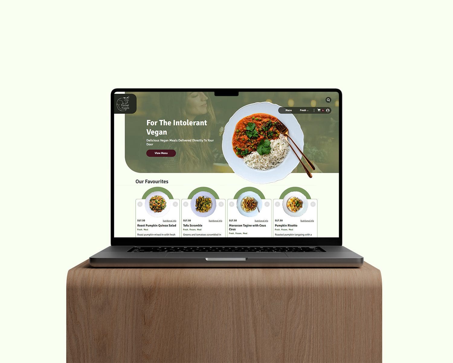
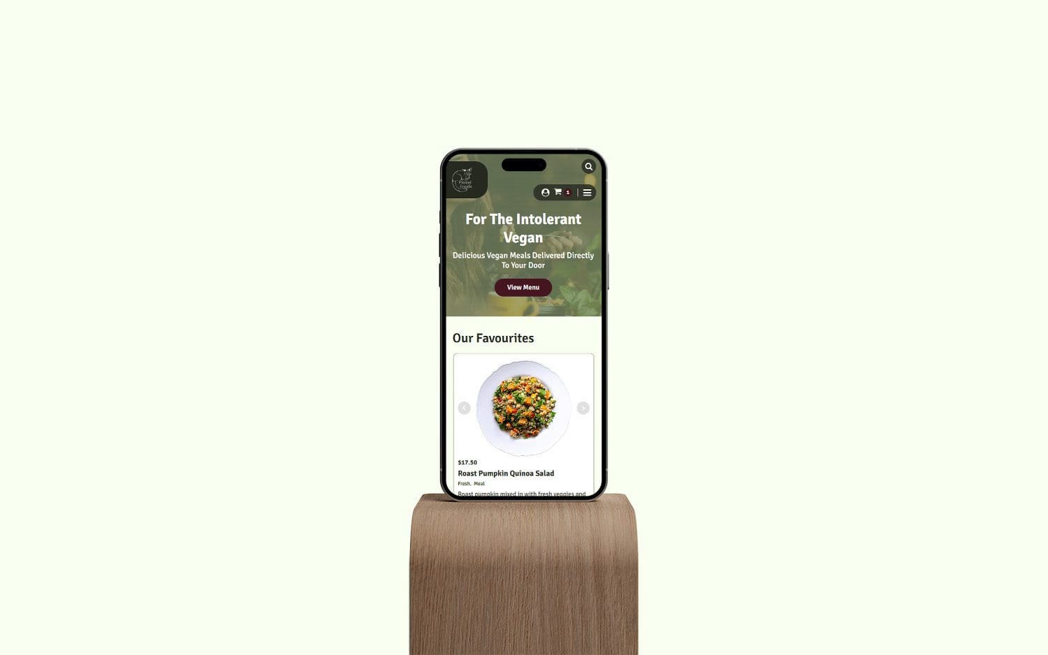
Passel Foods are a Melbourne based start-up that specialise in creating and delivering vegan ready made meals that cater to a wide range of dietary intolerances.
Sarah at Passel Foods approached our Melbourne based partner at Bluesight Studio to assist in creating their online store, they required a variety of functionalities such as eCommerce, subscriptions, and clear indications as to what meals were suitable for the various dietary intolerances. Before the introduction of the website Passel foods were primarily trading via direct messages on their social media channels and a website would remove the admin work involved in taking their orders in this manner.


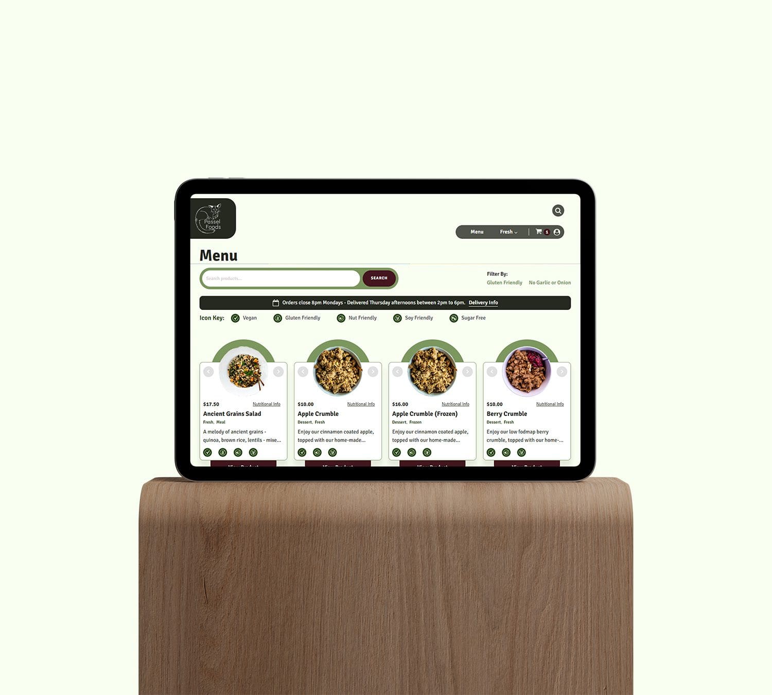
The primary function of the Passel Foods website is to act as an eCommerce platform, therefore we prioritised the organisation of products into various categories to ensure that users could easily find the meals that suited their lifestyle, whether that be fresh or frozen, or suitable for their dietary requirements such as, gluten friendly, Low Fodmap, Sugar Free, etc. This allows users to only see products that are right for them.
Passel Foods already had a logo and primary brand colour before we started work on the website project with them, but had no other brand assets. Therefore we used the website designs as a way to inform their visual identity going forward.
We opted to introduce a variety of light and dark green tones based on their primary brand green and a contrasting maroon to be used for primary CTA's. We wanted the site to feel fresh and contemporary in design while not being so sanitised that it lacked character. Therefore we used a pale green base to the website that felt less stark than a pure white background and gives the site an organic feeling that somewhat represents the vegan ingredients that are used in their meals. The primary green was used to add decorative graphic elements throughout the site to ensure this colour remained prominent and aligned with the graphics they had already made for their social channels.
We opted to use Signika as the brand font due to it being easy to read at large and small sizes and various weights. Signika also has slightly rounded corners to its forms adding to the organic and friendly appearance while maintaining a sense of maturity.