Rainbow Productions are world leaders in creating bespoke mascot characters and costumes and supply some of the biggest and most renowned brands worldwide.
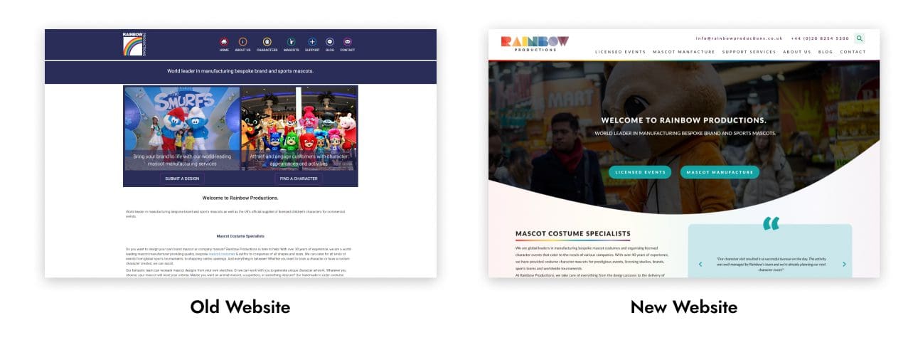
Rainbow Productions came to us with a desire to refresh their visual identity and website as their current brand and site did not truly reflect their industry leading position due to a somewhat dated aesthetic.
Rainbows previous visual identity relied on the use of a primary dark purple tone that had a slightly desaturated flat feeling with splashes of other colours in the rainbow that could become muddied when placed on the background of purple. They also had a logo that was on the nose, featuring half a rainbow on a white background with the company name oriented along the top and right edge of the logo icon. This identity didn't radiate the fun and excitement that a world-leading mascot manufacturer should have.
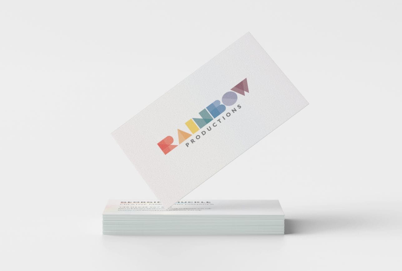
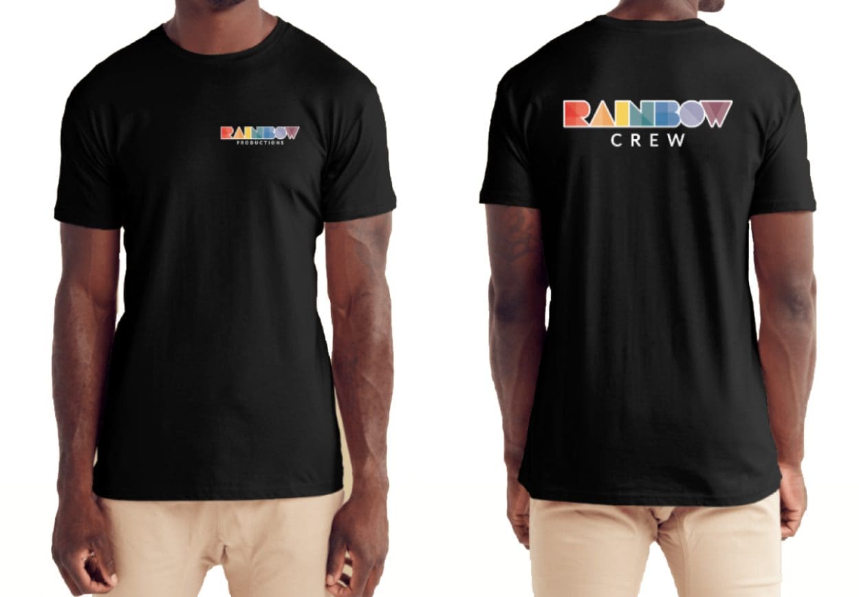
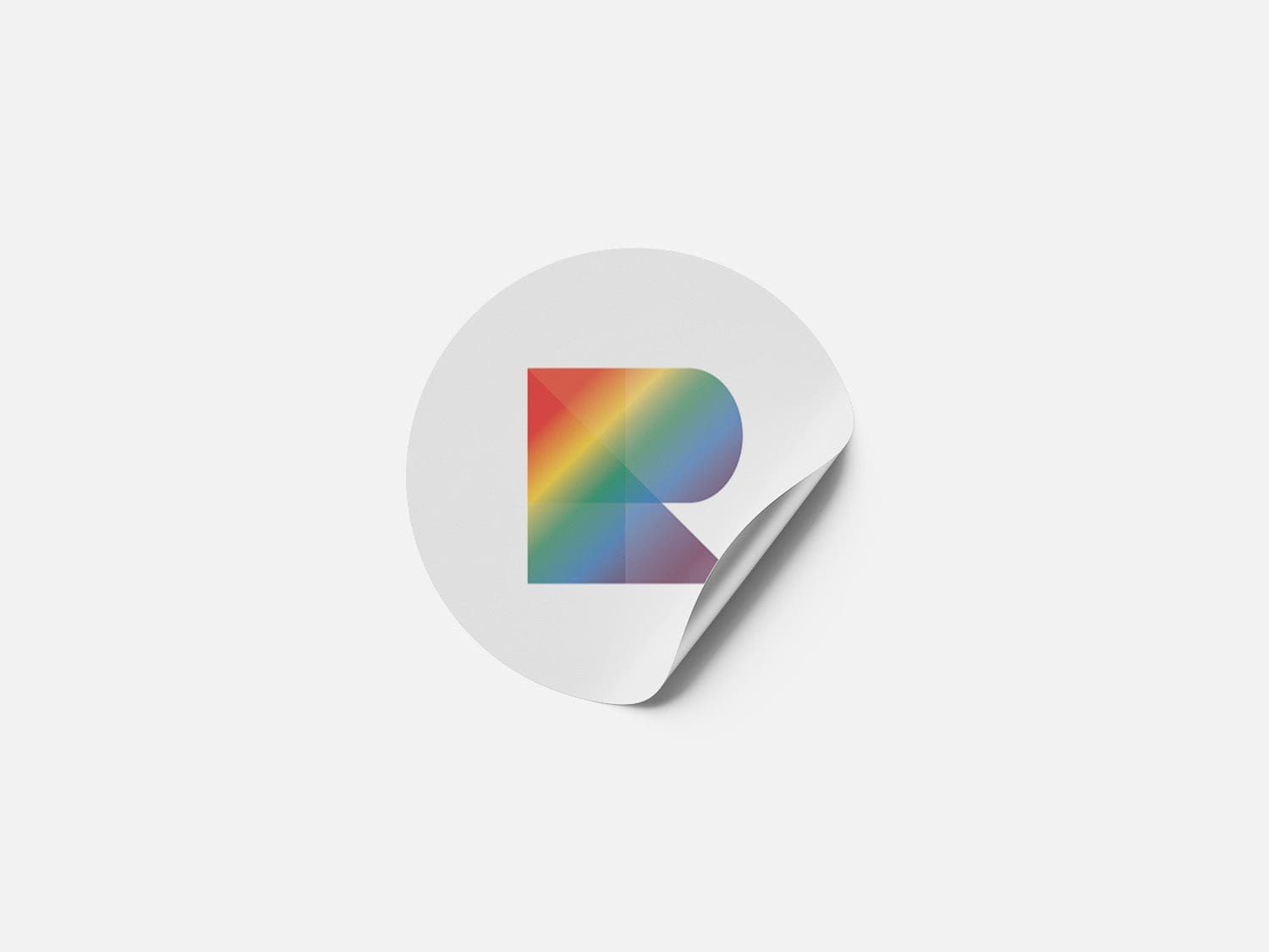
Bluesight Studio developed a new logo and visual identity that makes better use of an adapted rainbow colour pallet and has a fresh youthful feeling that also remains clean and professional.
The updated Rainbow Productions logo uses a word-mark format that is made up of geometric shapes of varying opacities and hues. The geometric shapes relate to the various cuts of fabric used in the process of manufacturing a costume. The logo is also horizontally oriented, which ensures it is easy to apply to a variety of collateral.

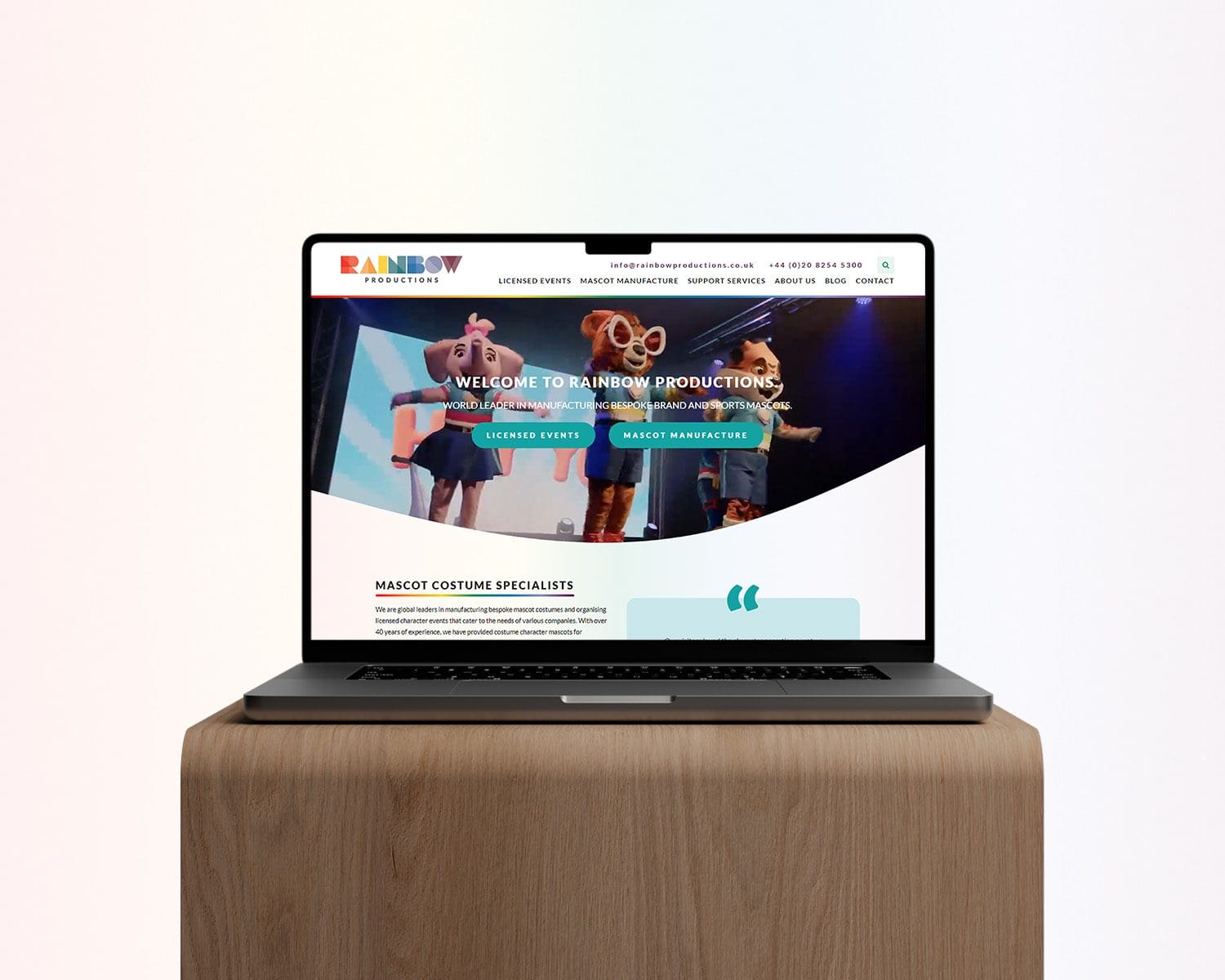
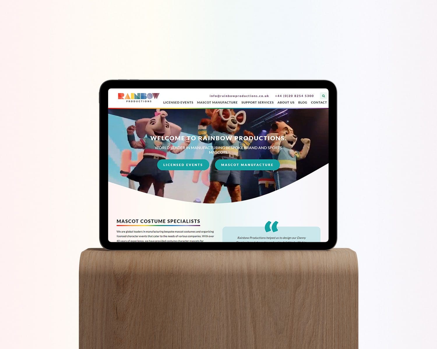
Due to Rainbows Productions previous site being built on WordPress, it made sense to continue using it as the CMS of choice for this project. We put together a new sitemap that structured pages in a conventional hierarchy that would ensure that not only users could navigate the website easily, but also search engines such as Google and Bing.
The design of the website acted as a tool to help the development of the rest of the visual identity based on the new logo.
The base of the website consists of a very subtle rainbow gradient that is not immediately obvious but provides a canvas that is less stark that pure white and provides a little bit of fun for those who are looking closely. We utilised rounded corners on virtually all elements and introduced a simple yet effective way of incorporating a rainbow into the website without being overpowering and detracting from the content. This came in the form of using the rainbow to underline headings and break up the header, body and footer of the pages.
The website also uses a lot of drop-shadow effects to allow various elements to float above the surface giving the whole website a light feeling that is contemporary and exudes a feeling of professionalism.
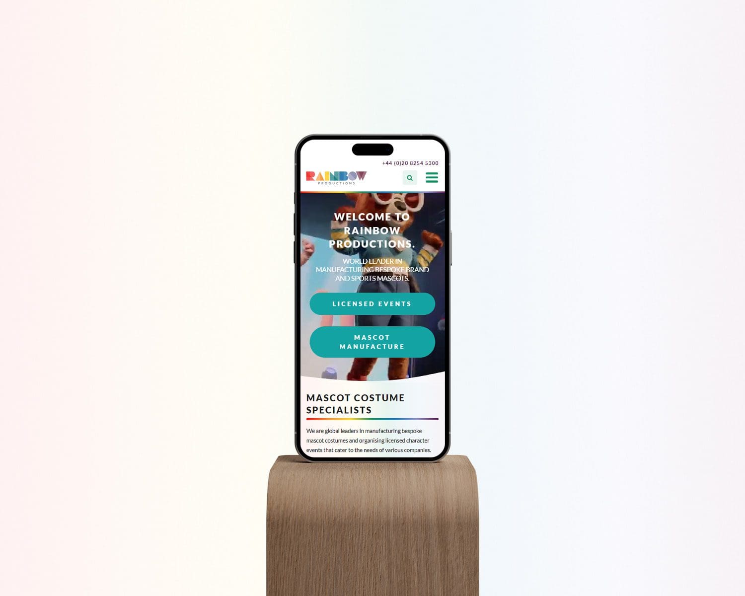
The whole site is fully mobile responsive and is a joy to use across devices of varying sizes. It was of the utmost importance to ensure the mobile version of the site was as effective as the desktop as a large portion of Rainbow Productions users come to the site via smaller devices. Therefore, certain elements were adapted to use carousels instead of stacking to eliminate the need for endless vertical scrolling, allowing users to get to the content they desired with efficiency and ease.
Overall, we are delighted with this project and Rainbow Productions were a joy to work with!
Just fill out a few details about what you desire from your new website and we will send you and instant estimate straight to your inbox!