Website Design | What is responsive web design?

Hey there, fantastic business peeps. Your here, so you must be ready to learn about responsive website design. Well today, we're diving into just that! If you're scratching your head thinking, "What's that?" – don't worry, we've got your back.
What is Responsive Website Design?
Before we jump into the nitty-gritty, let's strip away the tech talk. Responsive design is like having 3 pairs of shoes, one pair is for running, another for wearing with a suit and finally a pair of sliders for by the pool. Well, responsive design is similar, it allows your website to swap its shoes to suit its environment whether that is on a large desktop screen, a tablet device or your iPhone.
The Imperative of Responsive Design
Imagine this: You're checking out a website on your laptop, loving the sleek design. Then, you pull it up on your phone, and bam! It looks like a Picasso painting – all messed up. That's where responsive design swoops in to save the day. It's about making your website function flawlessly and look great across a range of screen sizes.
Key Elements of Responsive Design
Flexible Grid Layouts:
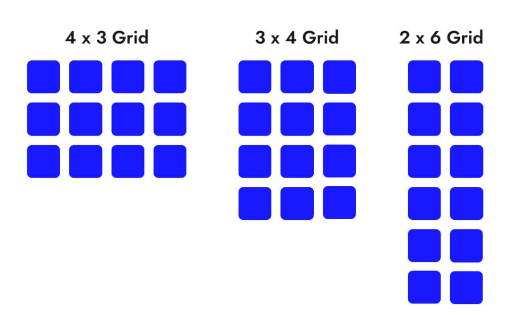
Think of your website as a dance floor – a flexible grid is like a choreographer making sure all your website components move gracefully. It helps elements on your site adjust proportionally, creating a harmonious visual experience across devices. A 3x4 grid on laptops can transition into a 2x6 grid on tablet screens and then into a 1x12 grid on mobile devices.
Media Queries:
Media queries are like having a conversation with your website. They ask, "Hey, what device are you on?" and then tailor the styling accordingly. It's your site's way of dressing appropriately for every occasion.
Responsive Images:
Think about a website banner image, on a laptop the viewport for that image is going to be a horizontal letterbox on mobile that image is likely to change into a taller aspect ratio, showing different parts of the image. Try to use images that work in a variety of aspect ratios. Alternatively implement an option in your website to show a different image on mobile.
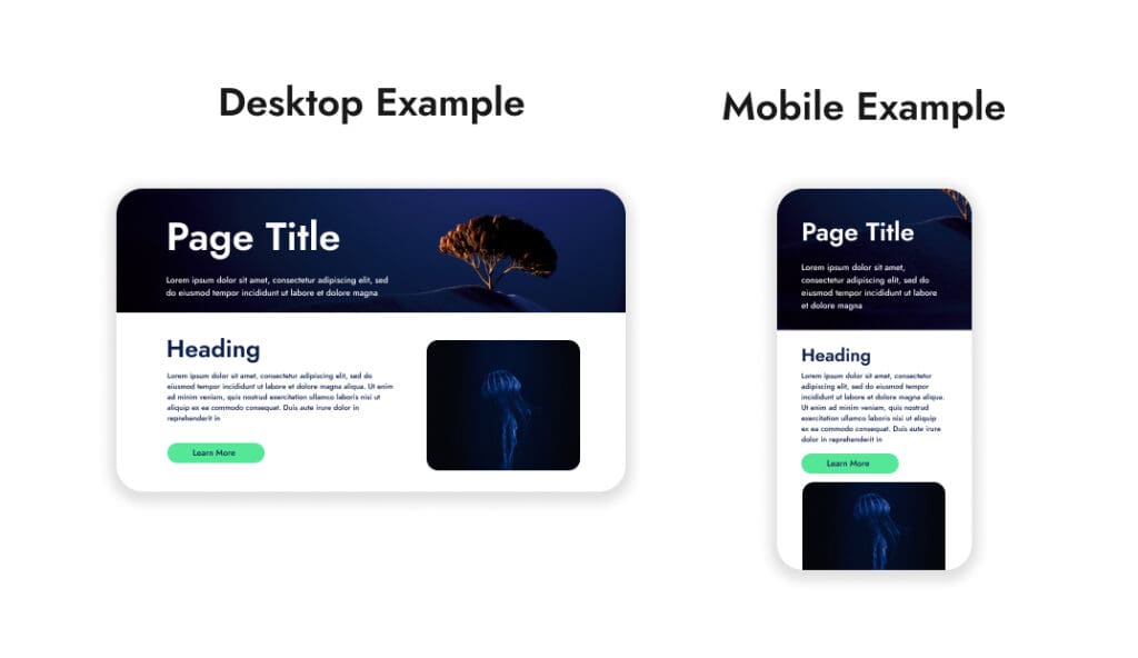
In the example above, on the desktop example you can clearly see the tree on the right side of the banner. That same image gets cropped differently on mobile and means that the main subject matter in the image is lost.
DIY Tips and Tricks for Implementing Responsive Design
Choosing a Responsive WordPress Theme:
Picking a theme is like choosing your outfit for a big event. Go for the one that suits the occasion, or in this case, your website's goals. Check out themes that proudly shout, "I’m responsive!" - If you have more budget, then consider opting for a completely bespoke built theme exclusive to your business.
Testing Responsiveness:
Testing is your dress rehearsal. Try out your website on different devices, see how it looks, and make adjustments. You wouldn’t want a wardrobe malfunction when your site goes live, right?
Speed Optimization for Mobile:
Imagine if the party you are attending is at a busy downtown club and the queue to get in goes twice around the block, you don't want to wait in a line for that long. Website speed is the same, ensure your website load quickly on mobile devices by optimising your images, cache your site, and cut down on unnecessary elements for a speedy, enjoyable experience.
The Power of Responsive Design in Action
Okay, picture this – I had a client whose website was like a Rubik's Cube on mobile. After some responsive design magic, the site transformed into a smooth, interactive experience. Result? Users stayed longer, engaged more, and bingo – conversion rates shot up. Responsive design isn’t just about aesthetics; it's a business booster.
Your Website's Secret Sauce
To sum it up, responsive design is your website's secret sauce. It's not just about looking good; it's about creating an experience that leaves your visitors saying, "Wow, this is awesome!" If you're serious about boosting leads and sales, responsive design is your VIP ticket.
Ready to Transform Your Website?
So, dear reader, if you're itching to level up your website game, dive into the world of responsive design. It's a game-changer, and it just might be the missing piece to your online success puzzle. Check out our Melbourne WordPress Websites for more insights and let's turn your website into a conversion masterpiece!