Making a Lasting Impression with Your Homepage

First impressions count, especially in website design where attention spans are shorter than ever. Your homepage is your digital storefront, that start of your users digital experience, and it has the power to make or break a visitor's perception of your brand. In just a few seconds, users decide whether to stay or leave, so it's crucial to make those moments count.
The internet is a vast and competitive space, particularly in industries where numerous options vie for the same audience. To stand out, your website needs to load quickly and efficiently. Slow loading times can turn users away before they even see your content . Choosing the right platform, such as WordPress, can help optimise your site's speed and performance, giving you an edge in a crowded digital landscape.
Understanding the importance of your homepage
What is a website homepage?
Have you ever wondered what exactly a homepage is? In simple terms, a homepage is the first page that appears when you visit a website. It serves as the virtual front door, introducing visitors to the content and purpose of the site. When it comes to your homepage, good web design plays a critical role in creating a positive user experience, as it typically includes navigation menus, search bars, and essential information is is vital for effective web design. A well-designed homepage should be visually appealing, easy to navigate, and provide clear direction on where to find specific information on the site. Ultimately, a homepage sets the tone for the rest of the website, making it a crucial element in the online world.
Why is your homepage important?
Your homepage is the first impression your website gives to visitors, making it a crucial component of your online presence. As the virtual front door to your site, it sets the tone for what users can expect to find and navigate through. A well-designed homepage can attract and retain visitors, drive traffic to important pages, and ultimately contribute to achieving your website's goals. With a clear layout, engaging content, and easy navigation, your homepage can make a lasting impact on users and encourage them to explore further. Make sure your homepage reflects your brand identity and provides a seamless user experience to leave a positive impression on visitors.
The impact of a well-designed homepage
A well-designed homepage can make a huge difference in the success of a website. It is often the first impression that visitors get of a brand, so it needs to be engaging and easy to navigate. A visually appealing layout with clear navigation can draw users in and encourage them to explore further. In addition, a well-designed homepage can also help with SEO, as search engines value user-friendly websites. Overall, investing in a professional homepage design can lead to increased traffic, higher conversion rates, and improved brand perception.
Did you know: It only takes 50ms for your website to be assessed by your users
What every good Homepage should include

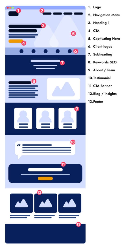
A captivating headline
When a user first lands on your website, a one of the most critical elements to capture their attention is having a short, succinct headline that tells users your primary business function and what services you provide.
If your services are used by a large variety of user personas who may be new to your services and industry, is it important to make sure that your heading is understandable by everyone who reads it. If you work in a highly niche or specialised industry then you may get away with being more specific.
For an improved mobile browsing experience, it is important to utilise larger fonts for your headlines. Small fonts can force mobile users to unnecessarily zoom in to read your content, resulting in a frustrating user experience. When structuring your content, always make sure to use H1 tags for your page titles, and then follow with H2, H3, and so on for subheadings in a logical order. By avoiding the practice of skipping heading levels, you can ensure that your content remains easily scannable and navigable, ultimately enhancing the overall user experience on mobile devices. Keywords: mobile experience, bigger fonts, headlines, H1, H2, subheadings, heading levels, user experience, mobile browsing.
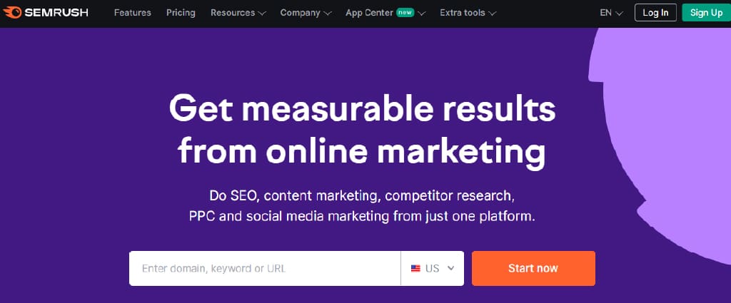
In the example below from SEMrush, they use the H1 'Get measurable results from online marketing'. This heading is to the point and instead of focussing on the 'technicalities' of what SEMrush provide, it tells users what they can expect by using their services. SEMrush will have SEO Specialists looking at using their services but also small 'mom and pop' businesses who may not be well versed in the jargon associated with Search Engine Marketing.

A Sub-heading that compliments the main heading
Your subheading should succinctly describe the range of services or products you offer, emphasising how they can solve common customer issues. By using targeted keywords that reflect your offerings, you can attract the right audience to your business. This section should serve as a brief and informative summary that complements the main title and draws in potential customers.
Value Proposition
When it comes to showcasing your business on your homepage, it is crucial to clearly articulate your unique value proposition (UVP) in order to stand out from the competition and attract potential customers. Your headline, sub-headline, or a separate section should clearly highlight what makes your business special and why visitors should choose you over others in the market.
Whether it's exceptional customer service, a unique product offering, or competitive pricing, make sure to communicate this key message effectively to drive conversions and build trust with your audience.
Create compelling Call-to-Actions (CTAs)
Include a prominent CTA on your page that directs visitors to take a specific action on your website, such as signing up for a newsletter, requesting a quote, making a purchase or redirects to your contact page form. Make sure the CTA stands out visually and is compelling enough to encourage action.
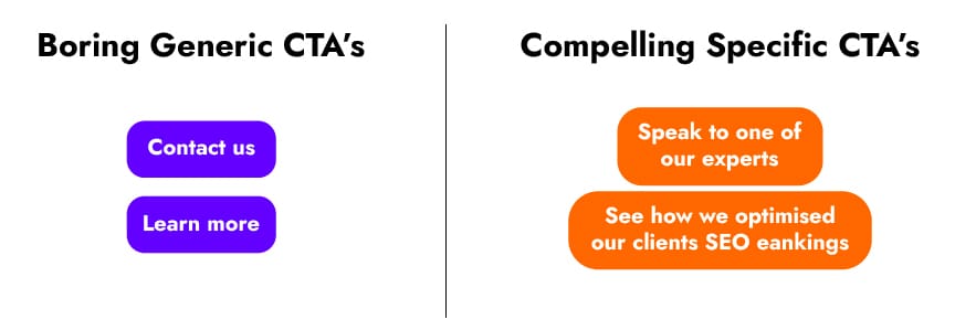
When writing a CTA for your website homepage is is important to not use generic terms such as 'contact us' or 'sign up' but try instead to use more specific copy such as 'Book a consultation' or 'Learn more about how we reduced marketing costs'. These types of CTA are more specific, informs users of what the action is, and have a higher click conversion rate.

Make it look great!
When working on your website design for your homepage, it is crucial to incorporate high-quality images, videos, or graphics to effectively showcase your products or services. Utilising visually appealing elements will not only enhance the overall aesthetic of your website but also create a more engaging and memorable experience for visitors.
By strategically incorporating visuals that align with your brand and message, you can effectively capture the attention of your target audience and leave a lasting impression. Don't underestimate the power of visuals in making a strong first impression and conveying the essence of your business in a visually appealing way.
For mobile optimisation, ensure your images are high-quality yet have a smaller file size. HubSpot users need not be concerned, as images uploaded to the software are automatically compressed. Otherwise, tools like TinyPNG can help. Additionally, include alt text with your images to improve accessibility for screen reader users and enhance your SEO efforts.
Create an easy to use navigation menu
Your website's navigation menu is a critical element that can significantly impact user experience. It should be designed with the user in mind, making it easy for visitors to find the information they need quickly and intuitively. Utilising user-centric design principles is key to achieving this goal.
A well-designed navigation menu should be clear, concise, and organised. It should clearly indicate the different sections of your WordPress website and the information available within each section. To further enhance navigation, consider using dropdown menus or megamenus for websites with a large amount of content. These features can help visitors navigate more efficiently, especially when exploring complex websites with a wide range of topics or products.
Dropdown menus allow you to present subcategories or additional pages within a specific section, providing visitors with a clear path to the information they seek. Megamenus are a more expansive version of dropdown menus, offering a larger, more detailed menu that can accommodate a greater amount of content. This can be particularly useful for websites with extensive product catalogs or diverse content offerings.
By implementing these features, you can improve the overall usability of your website and create a more engaging experience for visitors. A user-friendly navigation menu can encourage visitors to explore your site further, increasing the likelihood of them finding what they're looking for and ultimately achieving your website's goals.
Let your users know how great your businesses is by using social proof
To establish trust and credibility with website visitors, it is crucial to include social proof elements like customer testimonials, reviews, and client logos. By showcasing positive feedback from previous clients, potential customers can feel reassured and confident in the products or services being offered.
Incorporating these social proof elements not only builds trust but also helps in converting leads into loyal customers. Ultimately, by highlighting the experiences of satisfied clients, businesses can create a strong foundation for their brand and attract more customers.
Include an "About Us" section to tell your users who you are
The "About Us" section is a crucial component of your website that offers visitors insight into who you are as a business. It goes beyond the products or services you offer, providing a glimpse into your company's history, mission, and values. This section is an opportunity to humanise your brand, making it more relatable and establishing a connection with visitors.
In the "About Us" section, you can share the story behind your business, including how it was founded, the challenges you've overcome, and the milestones you've achieved. This narrative can help create a personal connection with visitors, showing the human side of your brand and building trust.
Additionally, you can use this section to highlight your company's mission and values. By articulating what drives your business and the principles you stand for, you can attract like-minded customers who resonate with your ethos. This can also help differentiate your brand from competitors and showcase your commitment to certain ideals or causes.
Ensure your users can get in touch by including a contact section
Ensure that your contact details, including your phone number, email address, and contact form, are clearly visible on your homepage to make it convenient for visitors to get in touch with you. This simple step not only boosts trust in your business but also enhances its accessibility, ultimately improving customer engagement and satisfaction.
Homepage SEO best practices
Optimising homepage content for search engines
When it comes to maximising the visibility of your website on search engines, optimising your homepage content is key. By strategically placing relevant keywords throughout your homepage, you can increase your chances of ranking higher in search engine results.
Including a mix of primary and secondary keywords in your headings, subheadings, and body content will help search engines better understand the relevance of your website to users' search queries. Additionally, ensuring your homepage content is clear, concise, and informative will not only improve your search engine rankings but also enhance the overall user experience. So, take the time to review and refine your homepage content to attract more organic traffic to your site.
Incorporating keywords strategically
When it comes to incorporating keywords strategically into your content, it's important to think about placement and frequency. Keywords should be naturally woven into your writing to ensure they flow seamlessly and don't disrupt the reader's experience. By researching popular search terms and integrating them into your headings, subheadings, and metadata, you can greatly improve your chances of being discovered by your target audience.
Remember, the goal is to be informative and engaging while also appealing to search engines. So, take the time to research and implement relevant keywords effectively for optimal results.
Making data-driven decisions for homepage improvements
When it comes to improving your website's homepage, relying on data-driven decisions is essential. By analysing user behaviour and engagement metrics, you can identify areas for improvement and make informed decisions to enhance the user experience. Whether it's adjusting the layout, updating content, or tweaking the design elements, using data to guide your decisions ensures that you are making changes that will have a positive impact on your audience.
So, next time you're looking to make improvements to your homepage, remember to turn to the data for insights that will help you make the right choices.
Summarising key points for creating a lasting impression with your homepage
In order to create a lasting impression with your homepage, it is essential to focus on key elements such as clean design, easy navigation, and compelling content. A visually appealing layout with high-quality images and a clear call to action can capture the attention of visitors and encourage them to explore further.
It's also important to ensure that your website is mobile-responsive and loads quickly to provide a seamless user experience. By incorporating these key points into your homepage, you can leave a positive and memorable impression on your audience.
Get in touch and begin your website redesign journey
If you are in the midst of finding a local website design agency that has creative web designers, reliable web developers and knowledgeable SEO experts, then get in touch with Bluesight Studio today and book in a consultation call.
